Update
5/10/2023
Microsoft has since updated their container platform components to include a border radius property and drop shadow.
This was after many months of discussion, waiting, incorporating my suggested changes into the creator kit for release, more waiting, and so on:
And then finally:
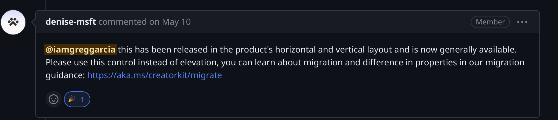
I’m actually very glad they incorporated the border radius (and drop shadow!) into the native platform controls. This will save users a non-trivial amount of time:
- No need to add the creator kit dependency to your solution
- No hacky CSS-in-html-text-control workarounds
I don’t know how closely the Power CAT team works with the platform engineers (in my experience working with Microsoft, teams can be siloed), so I’m not sure if they had any influence on this decision or not. Perhaps the platform team already had this in the backlog. Either way, I’m glad it’s there.
Introduction
There is much to say about the Creator Kit but I want to focus on one code component in particular: Elevation. From the documentation:
Elevation is used to draw focus to an experience and add a physical materiality to the app. Shallow levels are reserved for items that are closely connected to the canvas or view, such as tiles. Deeper levels create a prominent frame around the surface, drawing strong focus to self-contained experiences like dialogs. Supports mouse hover events.
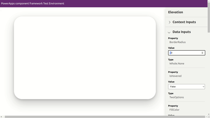
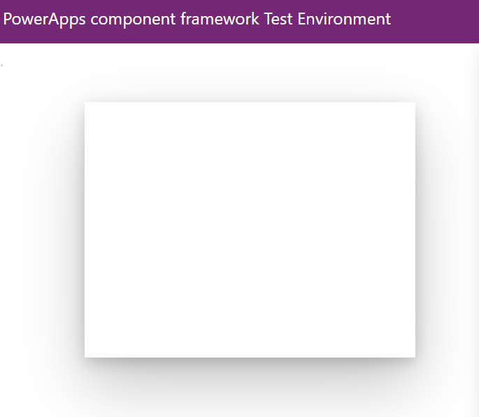
In short, it’s a very useful component to leverage for cards, dialogs, etc. One property that I was in need of was the ability to set and adjust the border-radius. Out of the box, elevation has a static border radius of 0px. Here is the component in the test harness with the default value:
For most use cases, this is probably fine. An advantage of using this code component inside a power app, however, is how much easier it is to create a uniform box-shadow with the Depth properties of the component. The usual method for creating this depth (shadow) is to write the html/css inside an HtmlText control. This method will still be necessary for any static, offset box-shadows. But dropping in an elevation component and setting depth properties (both default and onHover) is just too easy. Except if you need a non-zero border-radius.
Powercat Code Components … code
Under the hood of the creator-kit, we see that the PCF controls originate from the Power CAT (Customer Advisory Team) Code Components. After forking the repo and git clone-ing, and after going through several examples and tutorials on building basic PCF code components, here is where I began:
ControlManifest
Peaking inside the ControlManifest.Input.xml file, we can examine the declared control properties, what kind of control it is, any file dependencies such as css files, etc.:
<manifest>
  <control namespace="PowerCAT" constructor="Elevation" version="0.0.1" display-name-key="Elevation" description-key="Elevation_Desc"
control-type="standard">
  ...

</manifest>
Note that elevation is a standard as opposed to virtual control. Read this Microsoft blog post for info on virtual vs standard controls. It’s also worth watching this video by Scott Durow on virtual React controls.
Because it’s a standard control, I knew that it would be more expensive, performance-wise, to use and reuse in my Power Apps. (This has to do with the react virtual dom, power platform, and fluent-ui. Read the above articles! Watch the video!). But Hey, I just wanted a border radius and was feeling tenacious so I kept going.
Here is the full ControlManifest.Input.xml file:
Mostly straight-forward: we have some fill, color, padding, and depth properties.
Okay, so this is our primary configuration file that lists all possible properties. Still no border-radius. That’s ok! We can simply add a new property directly into the xml:
<property name="BorderRadius" display-name-key="BorderRadius" of-type="Whole.None" usage="bound" default-value="0" />
component.types.ts
Next, lets look at the component.types.ts file:
// component.types.ts

export interface ComponentState {
  isHover: boolean
}

export const DepthClasses = {
  '0': 'cat-depth-0',
  '1': 'cat-depth-4',
  '2': 'cat-depth-8',
  '3': 'cat-depth-16',
  '4': 'cat-depth-64',
}
Not much happening in here: the ComponentState interface with the property isHover is the only interface used for this component. DepthClasses constants are used for the actual styling of the component.
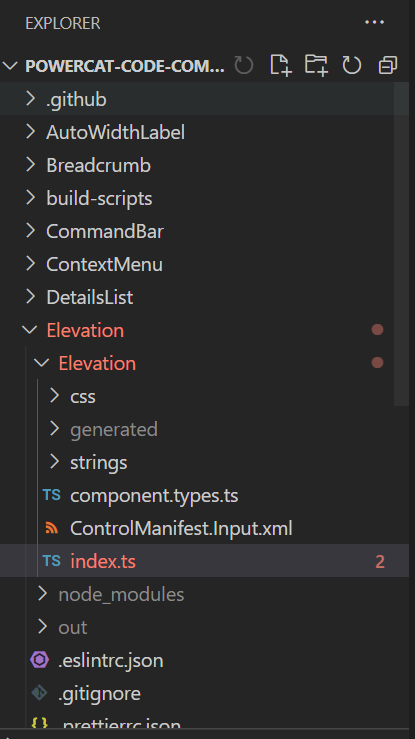
index.ts
Moving on we have index.ts. Below is the full file for reference and then we will look at snippets:
index.ts
import { ComponentState, DepthClasses } from './component.types'
import { IInputs, IOutputs } from './generated/ManifestTypes'

const defaultState: ComponentState = {
isHover: false,
}

export class Elevation implements ComponentFramework.StandardControl<IInputs, IOutputs> {
  container: HTMLDivElement
  notifyOutputChanged: () => void
  context: ComponentFramework.Context<IInputs>
  elevationContainer: HTMLDivElement
  outerContainer: HTMLDivElement
  state: ComponentState = { ...defaultState }
  // eslint-disable-next-line @typescript-eslint/no-empty-function
  constructor() {}

public init(
context: ComponentFramework.Context<IInputs>,
notifyOutputChanged: () => void,
state: ComponentFramework.Dictionary,
container: HTMLDivElement
): void {
this.notifyOutputChanged = notifyOutputChanged
this.context = context
this.container = container
this.outerContainer = document.createElement('div')
this.elevationContainer = document.createElement('div')
this.container.appendChild(this.outerContainer)
this.outerContainer.appendChild(this.elevationContainer)
this.context.mode.trackContainerResize(true)
this.attachEventListeners()
this.setStateDependentStyles()
}

public updateView(context: ComponentFramework.Context<IInputs>): void {
this.context = context
this.setStateDependentStyles()
}

public getOutputs(): IOutputs {
return {
IsHovered: this.state.isHover,
} as IOutputs
}

public destroy(): void {
this.detatchEventListeners()
}

private setStateDependentStyles() {
this.outerContainer.className =
this.context.parameters.DarkOverlay.raw === true ? 'cat-blocking' : ''

    const depth = this.selectStateValue(
      this.context.parameters.Depth.raw,
      this.context.parameters.HoverDepth.raw,
      '1'
    )
    this.elevationContainer.className = 'cat-elevation-container ' + DepthClasses[depth]
    this.elevationContainer.style.left = this.getPixelStyleFromParameter(
      this.context.parameters.PaddingLeft
    )
    this.elevationContainer.style.right = this.getPixelStyleFromParameter(
      this.context.parameters.PaddingRight
    )
    this.elevationContainer.style.top = this.getPixelStyleFromParameter(
      this.context.parameters.PaddingTop
    )
    this.elevationContainer.style.bottom = this.getPixelStyleFromParameter(
      this.context.parameters.PaddingBottom
    )
    this.elevationContainer.style.borderRadius = this.getPixelStyleFromParameter(
      this.context.parameters.BorderRadius
    )

    const fillColor = this.selectStateValue(
      this.context.parameters.FillColor.raw,
      this.context.parameters.HoverFillColor.raw,
      'white'
    )
    this.elevationContainer.style.background = fillColor

}

private getPixelStyleFromParameter(
pixelValue: ComponentFramework.PropertyTypes.WholeNumberProperty
): string {
return (pixelValue?.raw ?? 0) > 0 ? `${pixelValue.raw}px` : ''
}

private selectStateValue<T>(normalValue: T | null, hoverValue: T | null, defaultValue: T): T {
if (this.state.isHover && hoverValue) {
return hoverValue
} else return normalValue ?? defaultValue
}

private attachEventListeners() {
// We can't use mouseenter/mouseleave because of other canvas controls that can obscure this control
// (and we don't have control over pointer-event styles)
document.body.addEventListener('mousemove', this.bodyMouseMove)
}

private detatchEventListeners() {
document.body.removeEventListener('mousemove', this.bodyMouseMove)
}

bodyMouseMove = (ev: MouseEvent): void => {
if (this.context.mode.isControlDisabled || !this.context.mode.isVisible) return
const hit = this.hitTest(ev)

    if (this.state.isHover !== hit) {
        this.state.isHover = hit
        this.notifyOutputChanged()
        this.setStateDependentStyles()
    }

}

private hitTest(ev: MouseEvent) {
const elementRectange = this.elevationContainer.getBoundingClientRect()
return (
ev.clientX >= elementRectange.left &&
ev.clientX <= elementRectange.right &&
ev.clientY >= elementRectange.top &&
ev.clientY <= elementRectange.top + this.context.mode.allocatedHeight
)
}
}
All of the component logic is implemented inside index.ts. Notice the import statements:
// index.ts

import { ComponentState, DepthClasses } from './component.types'
import { IInputs, IOutputs } from './generated/ManifestTypes'
ComponentState and DepthClasses are manually added imports, whereas IInputs and IOutputs are auto-generated imports created when running npm run build in the project root directory.
The below class definition and method stubs are also auto-generated when initializes a new PCF project 1 by running pac pcf init --namespace PowerCAT --name Elevation -template field:
// index.ts

export class Elevation implements ComponentFramework.StandardControl<IInputs, IOutputs> {

    ...

    public init(
    context: ComponentFramework.Context<IInputs>,
    notifyOutputChanged: () => void,
    state: ComponentFramework.Dictionary,
    container: HTMLDivElement,
  ): void {
    ...
  }

  public updateView(context: ComponentFramework.Context<IInputs>): void {
    ...
  }

  public getOutputs(): IOutputs {
    ...
  }

  public destroy(): void {
    ...
  }

}
Helper functions
Now, on to the non-boilerplate function implementations inside index.ts. First, we’ll look at getPixelStyleFromParameter, selectStateValue and setStateDependentStyles:
  // index.ts

  private setStateDependentStyles() {
    this.outerContainer.className = this.context.parameters.DarkOverlay.raw === true ? "cat-blocking" : "";

    const depth = this.selectStateValue(this.context.parameters.Depth.raw, this.context.parameters.HoverDepth.raw, "1");
    this.elevationContainer.className = "cat-elevation-container " + DepthClasses[depth];
    this.elevationContainer.style.left = this.getPixelStyleFromParameter(this.context.parameters.PaddingLeft);
    this.elevationContainer.style.right = this.getPixelStyleFromParameter(this.context.parameters.PaddingRight);
    this.elevationContainer.style.top = this.getPixelStyleFromParameter(this.context.parameters.PaddingTop);
    this.elevationContainer.style.bottom = this.getPixelStyleFromParameter(this.context.parameters.PaddingBottom);
    this.elevationContainer.style.borderRadius = this.getPixelStyleFromParameter(this.context.parameters.BorderRadius);

    const fillColor = this.selectStateValue(
      this.context.parameters.FillColor.raw,
      this.context.parameters.HoverFillColor.raw,
      "white",
    );
    this.elevationContainer.style.background = fillColor;
  }
  private getPixelStyleFromParameter(pixelValue: ComponentFramework.PropertyTypes.WholeNumberProperty): string {
    return (pixelValue?.raw ?? 0) > 0 ? `${pixelValue.raw}px` : "";
  }

  private selectStateValue<T>(normalValue: T | null, hoverValue: T | null, defaultValue: T): T {
    if (this.state.isHover && hoverValue) {
      return hoverValue;
    } else return normalValue ?? defaultValue;
  }
getPixelStyleFromParameter()is a helper function that retrieves the pixel values bound to the fourPaddingproperties inControlManifest.Input.xml. I will call this function when adding the relevant border-radius code.selectStateValue()is another helper function called when setting depth and fill color inside the:setStateDependentStyles()function, which is called when the PCF is loaded (insideinit()) and whenever any external changes to the code component need to be processed (insideupdateView()).
Next, event listener function implementations:
  //index.ts

  private attachEventListeners() {
    // We can't use mouseenter/mouseleave because of other canvas controls that can obscure this control
    // (and we don't have control over pointer-event styles)
    document.body.addEventListener("mousemove", this.bodyMouseMove);
  }

  private detatchEventListeners() {
    document.body.removeEventListener("mousemove", this.bodyMouseMove);
  }
This appears straightforward, although the note inside attachEventListeners is interesting. The mouseenter and mouseleave events aren’t used because other canvas controls, e.g., a text box, can obscure the elevation control. As such, these event listener functions depend on two more functions that simulate mousenter and mouseleave events.
// index.ts

  bodyMouseMove = (ev: MouseEvent): void => {
    if (this.context.mode.isControlDisabled || !this.context.mode.isVisible) return;
    const hit = this.hitTest(ev);

    if (this.state.isHover !== hit) {
      this.state.isHover = hit;
      this.notifyOutputChanged();
      this.setStateDependentStyles();
    }
  };

  private hitTest(ev: MouseEvent) {
    const elementRectange = this.elevationContainer.getBoundingClientRect();
    return (
      ev.clientX >= elementRectange.left &&
      ev.clientX <= elementRectange.right &&
      ev.clientY >= elementRectange.top &&
      ev.clientY <= elementRectange.top + this.context.mode.allocatedHeight
    );
  }
}
bodyMouseMove is the listener passed to both addEventListener() and removeEventListener() inside attachEventListeners() and detatchEventListeners(), respectively.
Inside bodyMouseMove, it’s checking if the current mouse event is “hitting” the control (via hitTest()) and updating the control property isHover accordingly.
Lastly, the function hitTest() is checking whether the user’s cursor is intersecting with the elevation control. Hit-testing is a common method in graphics/UI programming used to determine if a user controlled object intersects another object.
Add the border radius
Okay, so now what? We’ve already added the control property inside the manifest. Now we need to add the actual code inside index.ts.
Because border radius is a style property, we need to add a single line of code inside the setStateDependentStyles() function. Recall that this function is invoked in updateView(), which takes care of re-rendering the UI for us anytime a property (in this case, border radius) is modified.
  // index.ts
    ...
    this.elevationContainer.style.borderRadius = this.getPixelStyleFromParameter(this.context.parameters.BorderRadius);
    ...
After running npm run build and (hopefully) getting no errors, we can test the property. Run npm run start to fire up the PCF test harness. A new browser window should open, where you can see the BorderRadius property on the right-side panel:
Lastly, the PCF can be deployed to a Dataverse solution using the following command:
pac pcf push --publisher-prefix <prefix>
And that’s it! Now I can use the elevation component with a border-radius. Let me know if you have any questions or feedback.
Read Create your first component for how to create a new PCF. ↩︎
An Interval, David Foster Wallace ↩︎