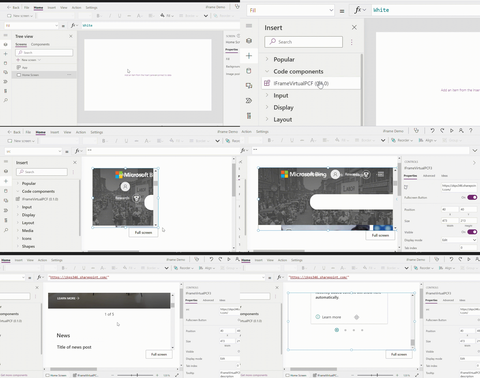
Gif by Greg Garcia. GitHub repo here.
It all started with a client who needed to embed an existing Canvas App inside another. Sounds straightforward, right? Well, it wasn’t. At first. But after some trial and error, i.e., conjecture and criticism, I ended up with an <iframe> PCF control that solved problem.
Prequisites
- Power Apps Component Framework: Specifically code components (custom controls), which are a type of solution component.
- React controls & platfrom libraries: I created a React component instead of the Standard component.
Key Features
- Seamless Web Content Integration: Utilize the
<iframe>element to embed external web pages within your Canvas Apps, creating a nested browsing context. - FluentUI for Enhanced UI: Leverages Microsoft’s FluentUI for building a user-friendly and cohesive interface, ensuring consistency with the Power Platform ecosystem.
- React-Based Virtual PCF: Built with React, this non-standard virtual PCF provides flexibility and efficiency in component development and integration. Moreover, there are performance gains to be had. From the docs:
You can achieve significant performance gains using React and platform libraries. When you use React and platform libraries, you’re using the same infrastructure used by the Power Apps platform. This means you no longer have to package React and Fluent libraries individually for each control. All controls share a common library instance and version to provide a seamless and consistent experience.
Configuration and Properties
The iFrame PCF allows developers to specify the source URL for the iframe and control the visibility of a fullscreen button. Out of the box, these properties can be easily configured to meet your app’s needs:
src: Define the URL of the webpage you wish to embed within your Canvas App.FullscreenButton: Enable users to expand the iFrame to the full screen of the host Canvas App for an immersive viewing experience.
Getting Started
Deploying the iFrame PCF to your Power Apps environment is straightforward. You can either download the managed solution from the GitHub releases page or use the Power Platform CLI for a more hands-on approach. Here’s how you can push the component using the CLI:
git clone https://github.com/yourgithub/IFrameVirtualPCF.git
cd IFrameVirtualPCF
Finally, you can push the component to your target environment. Don’t forget the publisher prefix:
pac pcf push --publisher-prefix <your-publisher-prefix>
Use it
Now you can use the control in your app, as shown below:

Add the relevant src property and continue on with your development.
Technical Details
The code for the control is straightforward. 1
IFrameControl.tsx
import { DefaultButton, Stack, ThemeProvider } from "@fluentui/react";
import * as React from "react";
import { IFrameControlProps } from "./Component.types";
const defaultSrc = "https://bing.com";

export const IFrameControl = React.memo((props: IFrameControlProps) => {
  const { width, height, onFullScreen, isFullScreen, showFullScreenBtn } =
    props;

  // Set default src to bing (or whatever)
  const src = props.src ?? defaultSrc;

  const containerSize = React.useMemo(() => {
    return {
      height: height,
      width: width,
    } as React.CSSProperties;
  }, [height]);

  const rootContainerStyle: React.CSSProperties = React.useMemo(() => {
    return {
      height: height,
      width: width,
    };
  }, [width, height]);

  return (
    <ThemeProvider style={containerSize}>
      <Stack verticalFill grow style={rootContainerStyle}>
        <Stack.Item
          grow
          style={{ position: "relative", backgroundColor: "white" }}
        >
          <iframe src={src} width={width} height={height}></iframe>
        </Stack.Item>
      </Stack>
      <Stack>
        {showFullScreenBtn && (
          <Stack.Item grow align="end">
            {!isFullScreen && (
              <DefaultButton onClick={onFullScreen}>Full screen</DefaultButton>
            )}
          </Stack.Item>
        )}
      </Stack>
    </ThemeProvider>
  );
});

IFrameControl.displayName = "IFrameControl";
You’ll notice the DefaultButton component that let’s users open their <iframe> content into “full screen” mode, i.e., the height/width of the <Stack> component.
The visibility of the fullscreen button can be toggled. The FullscreenButton and src are the two custom properties defined in the manifest:
ControlManifest.Input.xml
<property name="src" display-name-key="src" description-key="src" of-type="SingleLine.Text" usage="bound" required="true" />
<property name="FullscreenButton" display-name-key="Fullscreen Button" of-type="TwoOptions" usage="input" default-value="true" />
Wrapping Up
This iFrame PCF provides a seamless way to incorporate external content into Canvas Apps. By leveraging the power of React and FluentUI, it simplifies the development process while also improving performance of your canvas app.
Please feel free to contribute and/or make it your own. Visit the GitHub repo here: IFrameVirtualPCF
Yes, probably should rename this file so it doesn’t cause confusion with interface prefixing. 🤔 ↩︎